‪(281) 305-8865

Mobile Web Design

Effortlessly manage and update your website from anywhere and
at any time using the user-friendly WordPress Content Management System.

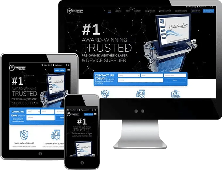
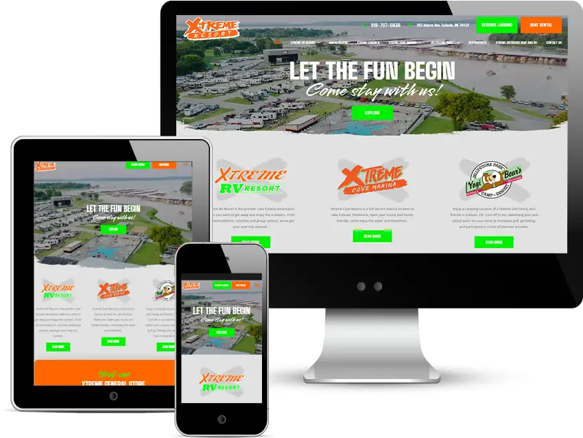
In today’s mobile-centric world, having a website that performs flawlessly across all devices is essential. At Octopi Digital, we specialize in mobile web design, ensuring that your website delivers a seamless and intuitive experience on smartphones, tablets, and other mobile devices. From responsive layouts to optimized navigation, we tailor every aspect of your website to engage and delight mobile users. Trust Octopi Digital to create a mobile-friendly website that enhances your online presence and drives results.

Mobile Web Design / Responsive Design

Get a mobile formatted, mobile friendly website that works on all devices. Contact us today!

Is Your Website Prepared for the Mobile Revolution?

The Latest and Most Advanced Technology in Mobile Web Design

Mobile web design utilizes cutting-edge technology to develop user-friendly and visually appealing websites that seamlessly adapt to different mobile devices. Through innovative techniques and responsive design principles, mobile web design ensures optimal performance and accessibility, enabling users to enjoy smooth browsing experiences on smartphones and tablets. Whether it involves optimizing layouts, improving loading times, or enhancing navigation, mobile web design prioritizes the needs of mobile users, ultimately driving engagement and boosting conversions.

Ensure Your Website is Accessible on Your Smartphone with Responsive Web Design.

What sets apart a desktop website from a mobile website?

Crafting an effective web presence involves understanding the distinctions between desktop and mobile websites. Desktop sites typically feature expansive layouts with detailed content and complex features, catering to users who engage more deeply with content. In contrast, mobile websites prioritize simplicity, efficiency, and ease of navigation to accommodate users on smaller screens. 

Effective design strategies for each platform must consider user expectations and device constraints to ensure optimal usability and engagement. While both desktop and mobile websites aim to deliver valuable content and engaging experiences, they require different design approaches. Desktop websites often showcase elaborate layouts and multimedia elements, while mobile websites focus on streamlined designs and intuitive navigation. Understanding these differences is essential for creating web experiences that resonate with users across diverse devices.


From SearchEngineNews.com regarding responsive web design:

Responsive web design is critical for modern websites, allowing them to seamlessly adapt to different devices and screen sizes. This approach ensures a smooth and consistent user experience on desktops, tablets, and smartphones. By focusing on adaptability and user engagement, responsive web design improves search engine rankings and boosts conversion rates. Adopting this strategy helps businesses remain competitive and effectively meet the varied needs of their online audience.


Recent Launches of Mobile Website Designs

Xtrem Resort

Mcb Reality

illusions By lnk Studio

DFW Open MRI

Responsive Web Design

Embark on a journey into the dynamic world of digital design with “Responsive Web Design.” This indispensable guide illuminates the path to creating websites that seamlessly adapt to the diverse array of devices in today’s digital ecosystem. From smartphones to tablets, laptops to desktops, discover the art and science of crafting visually captivating and highly functional web experiences that captivate audiences across all platforms. Dive deep into the principles of fluid layouts, flexible images, and media queries, and unlock the secrets to designing websites that remain stunning and intuitive, regardless of screen size. Whether you’re a seasoned developer seeking to refine your skills or a newcomer eager to explore the possibilities of web design, “Responsive Web Design” equips you with the knowledge and tools needed to thrive in the ever-evolving digital landscape. Elevate your online presence and engage audiences like never before with the power of responsive web design.

The Rapid Evolution of Mobile Web Design

As the usage of smartphones and tablets continues to surge, mobile web design is experiencing rapid evolution and expansion. This dynamic growth is driven by the increasing demand for websites that provide seamless and engaging experiences on handheld devices. Businesses are recognizing the importance of adapting their web presence to cater to the needs of mobile users, leading to innovations in responsive design and mobile optimization strategies. With technology constantly evolving and user expectations shifting, staying abreast of the latest trends and best practices in mobile web design is essential for businesses looking to maintain a competitive edge in today’s digital landscape.

Explore Our Portfolio of Stunning Web Designs

Birchwood Interior Design

Weight Loss Clinics

New House Home Solutions

Other Services

Explore our array of services, designed to elevate your online presence. As Houston’s premier web development company, we deliver reliable solutions tailored to your needs, ensuring your success in the digital world.